Why do fall leaves change colors? It’s because they’re so sweet! The more red the leaf is, the more sugar it likely has. Are you looking to change the color of your home this fall? Why not have a little fun with the colors? The options are endless when it comes to decorating this fall. The right interior paint color can completely transform the look of your home.
Whether you go explosive with oranges and reds or keep your palette neutral, your house will feel warmer and cozier than ever before. Read on for some vibrant choices worthy of a gorgeous autumn day.
Relaxing Fall Colors
For any room where relaxation is essential – including bedrooms – using soft, soothing colors will instill tranquility. Lavender would be lovely as an accent wall or as bedding for a great, memorable night’s sleep! You might not think of lavender as a fall color, but it definitely can be. It’ll look especially great if you combine grey with lavender. Take a minute to check out this complete guide for blending fall colors like lavender.
Autumn Grey Paints
Although less popular, grey can be used as an interior paint color for a cool theme that still manages to feel inviting. It has a natural texture and depth that makes it very versatile. A touch of grey on the walls of a home office would look smart against pictures of far-off places, while in a bedroom, it makes frames full of vacation snapshots pop!
If you want to keep things light but not too soft, then gray is perfect for you. You can find different shades of gray within the same family without being overtly similar. Pairing two different grays together also adds interest because they are similar enough to create a nice contrast.
Want to stand out? Try going for bright turquoise walls and complemented those with crisp white woodwork and fixtures.
Fiery Shades
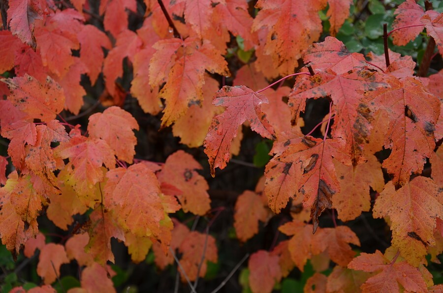
Fiery shades exude passion and energy. They’re lovely if you want a warm, inviting atmosphere that reflects a love for life or your family. If your early morning routine involves coffee in the kitchen, then this hue would be perfect for the dining area.
Fiery fall colors include shades of red, burnt orange, yellow, gold, and more. You can apply them in tandem or mix them in other colors to create the perfect hue for your home. Just make sure you know what works best with your current color palette before making a final decision.
Colorful Crimson
Crimson is an autumn color that you don’t want to miss out on this year! It’s reminiscent of changing leaves, which is why it makes us think of fall. This deep red tone looks lovely when paired with blue and green, which are commonly used in interior design.
Try using a blend of yellow, cream, and orange delicately painted onto the walls. They’re a wonderful blend of warm colors that work together flawlessly! Look for soft yellow colors when you’re blending them with cream shades.
For a great example of using this accent color, look no further than the famous sunflower. This robust flower has a main yellow center that fades into a light orange and a deep red. This is an example of mixing colors to make another color – in this case, red from yellow and orange from cream.
Citrus Colors
Nothing says fall quite like citrusy oranges and bright yellow lemons. Citrus colors will add brightness and cheer to any room. Since they come from nature, they belong in any environment where happiness is present. You can’t go wrong when these bright colors accompany accessories such as ceramic dishes or fabric pillows embroidered with sunshiney expressions like “Cheer Up!” and “Good Morning Beautiful!”.
You could see bright orange and yellow together or use one of the colors as an accent. For example, if you want to go with orange but think it’s too strong for your living room, use blue-green instead. You can picture oranges and lemons in that color combination, can’t you?
Muted Fall Paint Colors
Consider muted fall colors like taupe, moss green, and cream to achieve a more sophisticated look. These soft hues are perfect for creating an intimate setting.
You’ll see this look most often in homes where the décor is all about comfort – places where you curl up with a good book or enjoy long chats with friends over warm drinks. And although they’re easier on the eyes than brighter ones, they still provide enough pop to keep things interesting.
If you go for this color scheme, make sure there’s a healthy balance between these colors and an accent hue such as red or turquoise. An all-neutral color palette can be dull and uninviting. Instead, pick a color theme that lets the rest of the home shine!
Metallic Interior Paint Fall Hues
If you’d like to make your home look more expensive without spending a lot, try purchasing art and accenting it with metallic paint hues. These understated tones attract the eye and provide that little extra something that makes all the difference in appearance.
How should you blend metallic paints? It depends on the fall look you’re looking for. If you’re going for a more rustic theme, choose autumn brown shades with metallic accents. Or try combining gold with turquoise to bring about the same effect.
You could use gold and turquoise together or separately. If you want to go for a more earthy tone, then pick one of the colors and use that as your main color. If you’d instead add extra glam to your home, then choose both and apply them equally throughout!
As far as metallic interior paint goes, try using shimmering shades of gold since they’re perfect for fall decoration. Consider using leaf print decorations and painting them gold too. The leaves look like they’ve been dipped in actual gold leaf, which is an incredible achievement with only a couple of coats of paint!
Choose Fall Interior Paint Color Wisely
Now you know some of the best fall colors to transform the feel of your home. Choose an interior paint color that you’re excited about. Don’t hesitate to experiment!
Fall is the time of year for unique and daring ideas, which can work in your favor if you give them a chance. So don’t be afraid — get out there and start mixing colors! You might surprise yourself with how well they go together once they’re up on the wall.
Are you ready for a few more tips? Then see what the rest of this site has to offer!