Color is an indispensable part of design. Because humans are visual organisms, it is important that we pay attention to colors and the meanings and responses that they elicit. A good number of studies have been conducted on color and its effects. Here are some of those studies’ most important conclusions.
Colors Helps Retention
A 2010 study conducted by Dae-Young Kim of the University of Missouri aimed to determine how colored and uncolored images of tourist spots fared in getting people’s attention or enhancing their working memory. Marketers and advertisers, naturally, would want color to have a strong effect on attention. The industry has invested a lot on making ads bright and colorful just to get noticed.
However, the said research shows that color does not have a significant effect on getting attention. Color, however, appears to play a role in making images easier for respondents to remember. In several ways, the results of this study affirmed the color obsession that advertisers have. It’s just not in the way that many of them would have expected.
We can apply the insights from this study to interior design. It is safe to say that the use of bright colors can be reserved for areas where we need our working memories to be active. Study rooms, living areas, kitchens and in-home workspaces (if you have them) are probably the places where the brightest of colors should be used.
Responses to Red and Green
In 2003, undergraduate student Teresa M. Kutchma conducted a study that looked at differences in how people responded to green and red. She was studying the ability of either color to elicit stress responses in people. Her study required the respondents to wait in a green booth, red booth, or white booth before they were made to answer a questionnaire that measured their stress levels.
As expected, the results show that those who stayed in the red booth first had significantly higher stress levels than those who stayed in the green and white booths. Because of this, designers should be careful in using red in homes. It is wise to keep the color out of bedrooms and other areas where people are expected to relax.
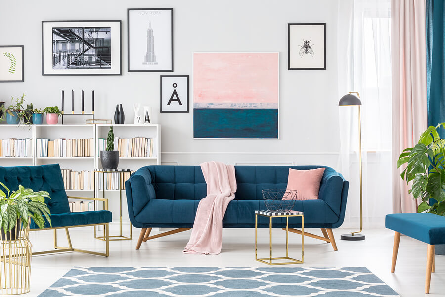
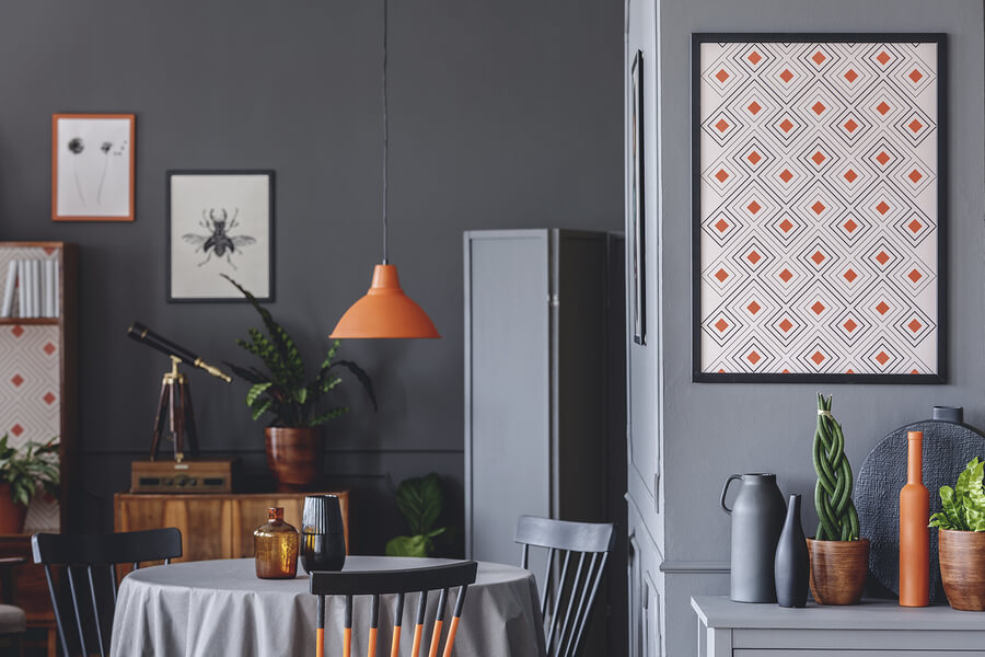
Other studies have shown that red, orange and other similar colors have the power to arouse the nervous system. Specifically, they have a stimulating effect on a person’s appetite. Because of this, it seems wise use them in areas where food is enjoyed.
Lighting and color effect mood
An influential 1987 work by Sorcar on architectural lighting revealed that colors tend to elicit different types of responses when they are put under varying levels of illumination. If the designer wants a particular place to elicit coolness, traditionally cold colors such as green and blue should be used. To maximize the colors’ effects, the designer can subject the area to moderate levels of illumination.
If the intention is to make a specific room conducive for activity, it must be kept bright. Not only that, the designer can also use bright colors such as red and yellow on the walls and ceilings.
In order to ensure a safe and effective lighting system, getting help from professionals is needed. If you are from the area, get the kind of Calgary electrical services that have been proven effective by the residents themselves. Do not settle for anything less.